Design
Pulling It Together
Graphic and layout design components work in harmony with the other elements
so the final product is seen as one unified image.
Be it a logo, a postcard, a brochure, an ad, or webpage, the design must be in sync with your vision and the 'look' you want conveyed. Layout design is just another form of visual communication to tell your story.
MARATHON WRITERS' Magazine
The idea: The lead instructor wanted to give the students a publication of their juried essays as a keepsake.
The plan: Keep it classy, crisp and clean, break up copy with pull out quotes, incorporate image(s) that reflect their writing at beginning, and judges’ comments. Final was designed magazine style, with an introduction, table of contents, essays, judge’s comments and section of each judge picture and biography.
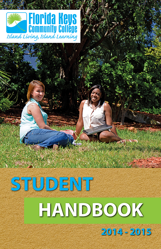
FKCC student handbook
The idea was that the handbook needed major text revisions and then to match with the college’s recent rebranding.
The Plan: The booklet used local student images, student images, college’s new color palette and fonts according to rebranding guidelines.
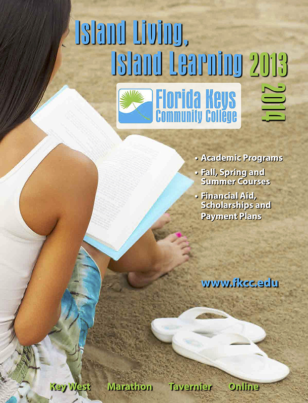
FLORIDA KEYS COMMUNITY COLLEGE SCHEDULE
The Idea: numbers of students enrolled in classes prior to start dropped when classes schedules could only be viewed online. A new type of printed schedule needed designing that would last of the year.
The Plan: Create a yearlong schedule with important dates, helpful information, main repeating courses in a compact format. Updates throughout the year would be posted elsewhere.
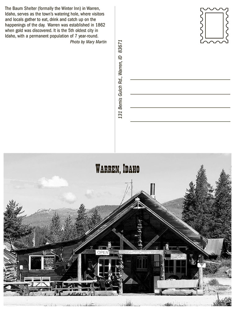
WARREN POSTCARD
The Idea: I was in the mountains of Warren Idaho, chatting it up with Jan, the
town’s postmaster, who claims the smallest official post office in the country and handstamps each piece of outgoing mail still. I thought to myself, "I’d love to write and mail out a hand stamped postcard from here."
The Plan: I took a quick pic of the Baum Shelter, Scratched up so thoughts fact checked details of town, found western font, and the postcard was born. You can still purchase them at the Baum which sits right next to the post office and proceeds go to the town fund.
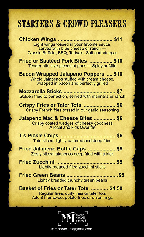
WARREN TABLE TOP MENU
The idea: The proprietor of the Baum Shelter wanted drinks, food, and prices listed; and placed within their tabletop stands.
The Plan: The size was fixed, so I choose a background similar to those old ”WANTED” posters of the West and the same font as the postcard for larger type.
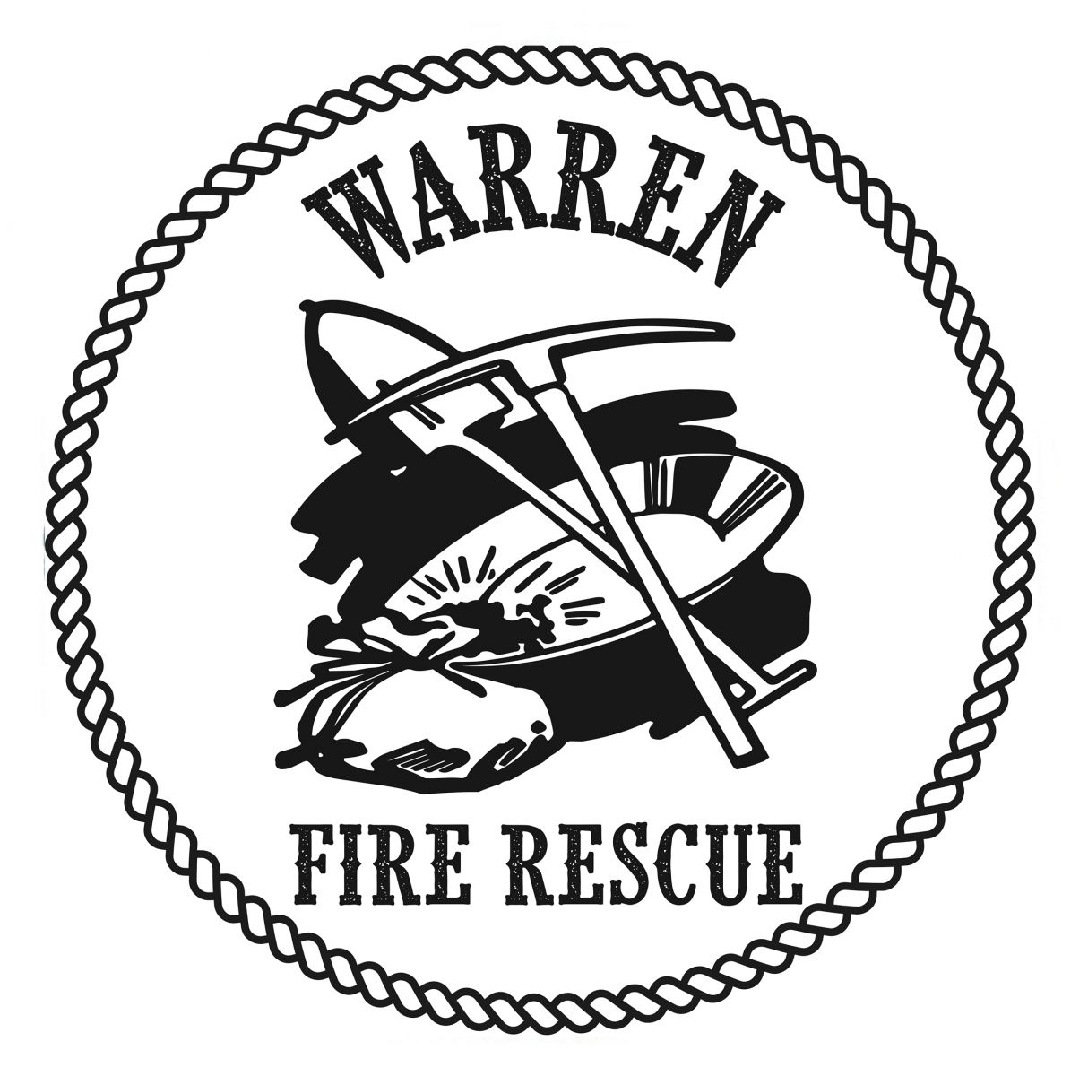
WARREN FIRE RESCUE LOGO
The Idea: the town decided to formalized a volunteer fire/rescue crew to respond to emergencies. A new 1950s fire truck was gifted and they wanted a decal on truck and crew shirts made with volunteers. I got called. Warren is old mining town in mountains of central Idaho.
The Plan: The logo needed to be visual sticking large as well as visible as a small logo on a shirt. I used the same western font yet again, found old-looking line art rope and an old-timer miner panning for gold. The logo now is affixed to the truck and on shirts with word “crew” for the volunteers.

.jpg)
